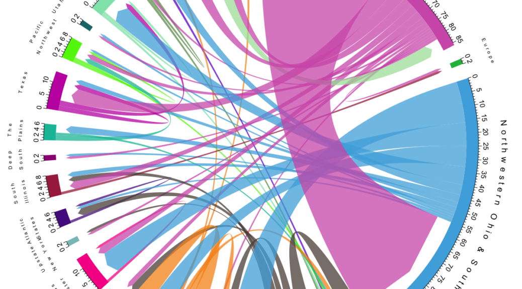
The migration flows of the Bührers lend itself to visualisation with a chord plot, done with R‘s circlize package after a post by Guy Abel.

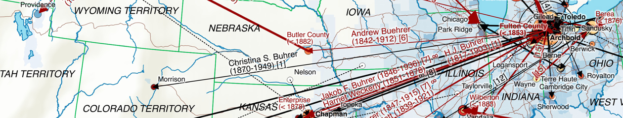
The plot shows migration flows between regions as well as flows within a region that exceed 200 km. “Regions” are essentially place clusters that have been visually identified on the map. It includes all persons born as Bührer (“Named”) from the dataset, where migration can be inferred based on georeferenced events. Note that a particular person can feature in several flows, e.g. first emigrating to northwestern Ohio with a subsequent migration to Kansas.
In contrast to my maps – that only show the United States – you can also see that some Bührers emigrated to Brazil (around Curitiba) as well as India (Mangalore). Either migration is likely to predate the known emigration to the United States.