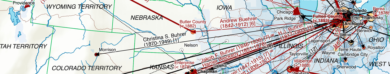
What data of the available Bührer dataset actually made it on one of the maps? A mosaic plot, done with the vcd package from the open source statistical software R (https://www.r-project.org), gives a quick overview over the relevant factors.

The plot essentially shows areas proportional to the number of persons, ordered by the emigration status (left) and map # (top). For a given combination the successive blocks in the color red, black and grey denote Named, Married and Descendants persons respectively (see The methodology – preparing genealogical data for maps for explanations). These three categories make up roughly 4’500 persons of the original dataset, with the remainder not being shown. The small circles denote combinations that didn’t occur in the dataset.
A few observations:
- Only a small fraction of persons in the dataset actually show up on map 1 and 2. This is comes as no surprise, given the large number of e.g. Swiss-based Bührers, “Assumed US” persons as known descendants of emigrants with no place information or “Undetermined” persons where location information could neither be determined nor inferred.
- The number of Bührers emigrating for the generation prior 1880 (map 1) is significantly larger than the number of emigrating spouses from Switzerland, reflecting the fact that most married once overseas. A look at the category “Third country emigrated to US” indicates that a substantial part of the Bührers – at least for the first generation – preferred to marry other emigrants.
- There’s very little Bührer emigration happening for the generations born after 1880 (map 2) – almost all Bührers in that period are America-born.
The plot has featured in a small presentation R User Meetup Mosaic plot Thomas Roth 20160803 (includes the R code) in a Zurich R User Group Meetup.