Category Archives: Maps

Historical Land Cover of the United States

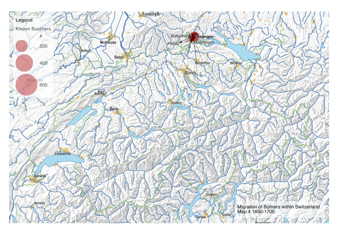
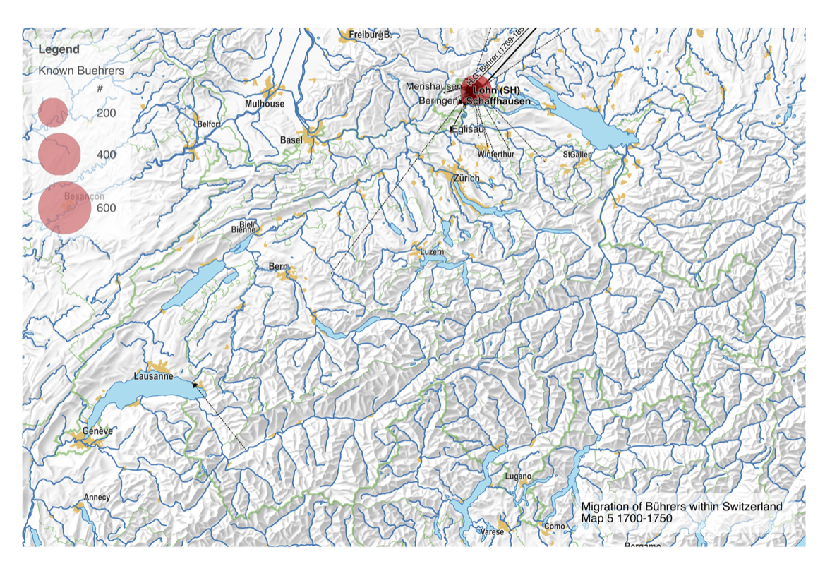
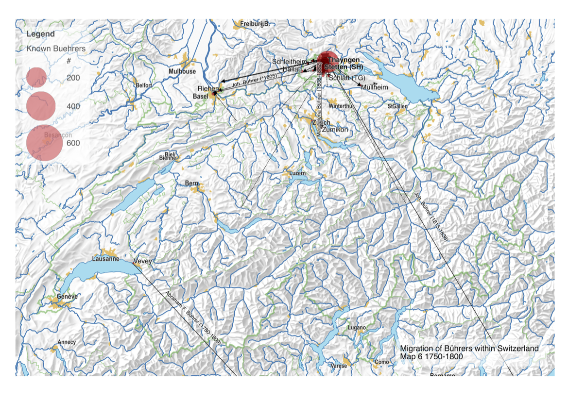
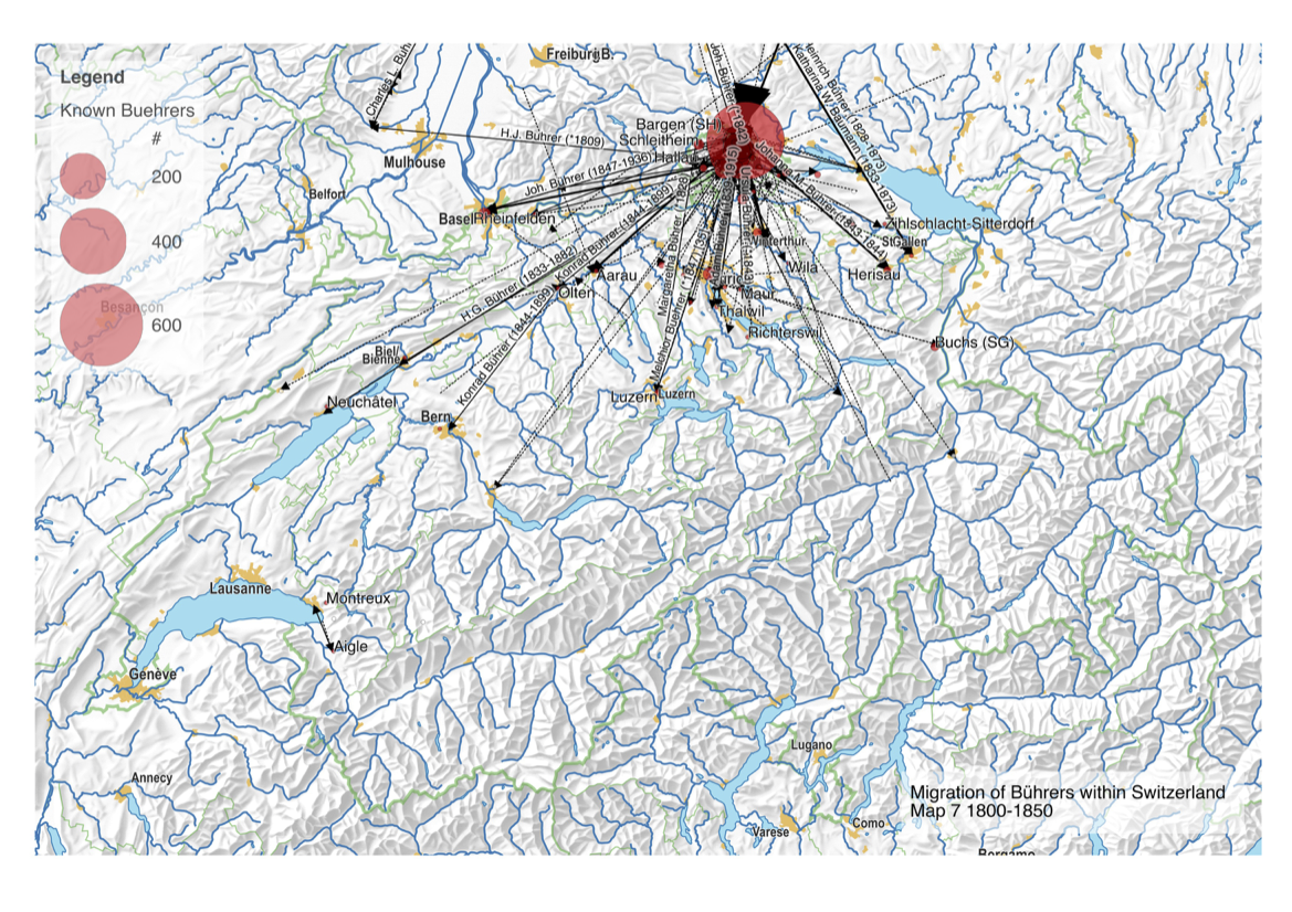
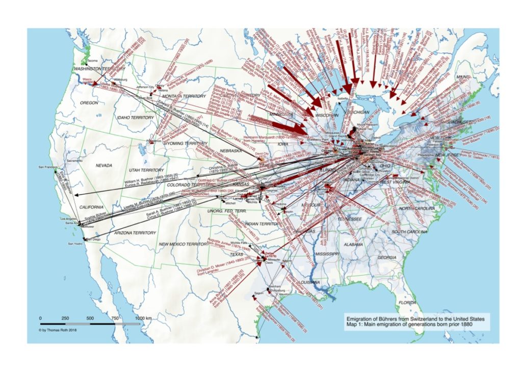
My first map versions used population density and railroads as a proxy for the state and direction of migration. But what about the destination? What was the land cover like at the time of emigration, given the fact that the large majority of emigrating Bührers hauled from the rural countryside and were farmers?

Land cover of the Northeastern United States around 1870

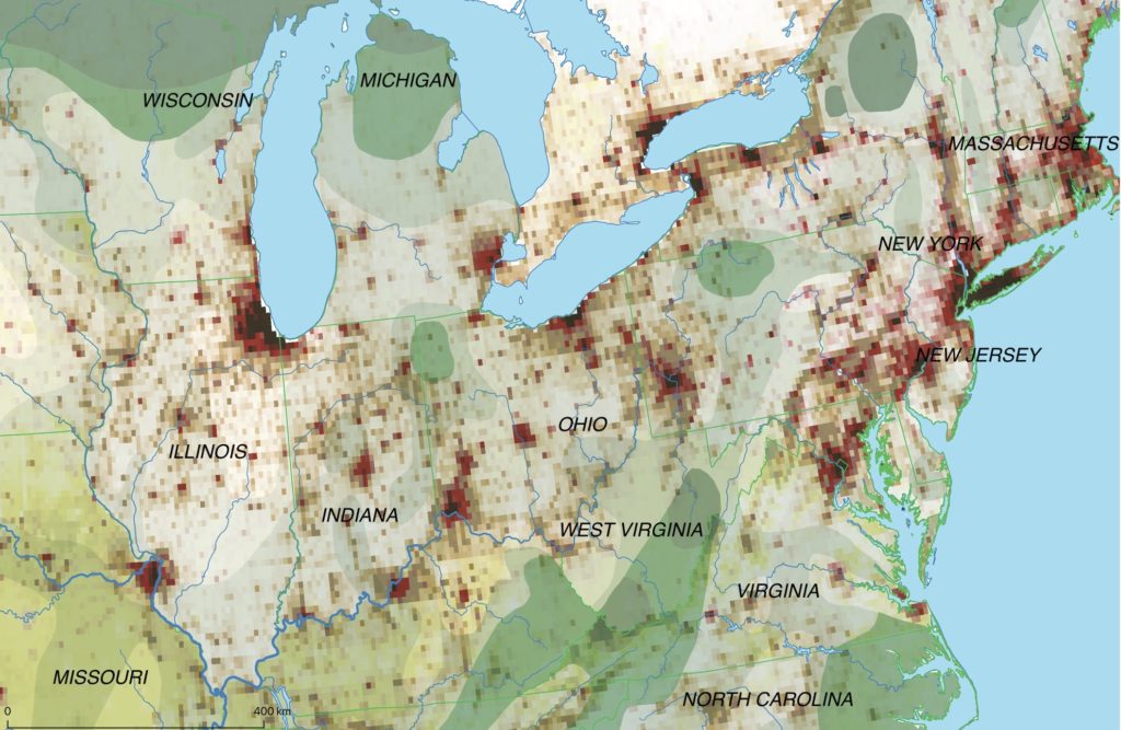
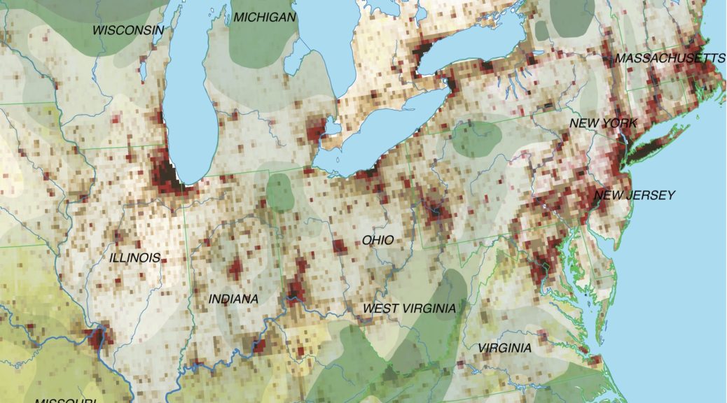
The map above shows the structure of the landcover around 1870. Red indicates urbanised centres, the yellowish green grassland, brown cropland and dark green forestland. Northwestern Ohio was still largely covered by forests (approx. 60% density), with yet only a recognisable patch of cropland around Bryan. Nowadays the forest is – with the exception of small remnants – gone and replaced by cropland. Agriculture completely changed the surface of Ohio.

The sources for this historical land cover were:

Astonishingly I wasn’t able to find period Ohio maps that include land cover information (e.g. forests).
ISLSCP II Historical Land Cover and Land Use, 1700-1990 provides a source for full land cover (https://daac.ornl.gov/ISLSCP_II/guides/historic_landcover_xdeg.html), albeit only at a very low one-degree resolution that wasn’t useful to produce maps. More interesting is Historical Land-Cover Change and Land-Use Conversions Global Dataset (https://data.nodc.noaa.gov/cgi-bin/iso?id=gov.noaa.ncdc:C00814), with half-degree resolution. There is also data for the Original Natural Vegetation of Ohio (https://apps.ohiodnr.gov/gims/report.asp, see theme id 3135), essentially almost exclusively forestland of different kinds.

How have Bührers spread throughout Switzerland?

Today, Bührers can be found in various cantons of Switzerland, however, most Bührers still hail from the Canton of Schaffhausen. How did this come about? A time series shows in 50-year steps from 1500 to 2000 (birth dates) where in Switzerland Bührers have been and how they’ve moved.

The earliest recorded Bührer in the dataset is Adam Bührer, who was born around 1533 in Bibern. Long-range migration in earnest starts only in the first of the 19th century.

Note that places have been aggregated at 2018 municipality level (e.g. Bibern and Hofen merged in 2009 with Thayngen). The circle size denotes the number of Bührers.

Revisited: Emigration of the Bührers from Switzerland to the United States

The original dataset from 2011 featured 4557 relevant persons (Bührers, spouses and their children/grandchildren). Up to 2017 the dataset had grown up to 9223 relevant persons, i.e. neatly doubled! This provided ample reasons to redo – with a couple of substantial improvements – the original mapping exercise.

Emigration of Buehrer to the United States – Map 1

The maps shows – as the earlier ones – the Bührers’ emigration to the United States (Map 1) up to the 1880s and subsequent internal migration up to now (Map 2).

Emigration of Buehrer to the United States – Map 2

A legend explains the symbology and the groups of emigrated Bührers with common ancestors. In contrast to the earlier maps there has been no manual tweaking, with exception of the orientation of the immigration arrows. The big challenge is clearly visible in Map 2: the larger number of persons means there’s really too much going on to fit it on one map!

The major changes compared to the earlier version in 2015 are:

  • Emigrated Bührers where matched against emigration/immigration evidence, e.g. passport lists, ships lists at port of embarkation, US immigration records and US census information. This allowed (see 2nd page of legend for emigrated groups of Swiss Bührers) to more accurately determine/narrow down the actual time of emigration.
  • Normalization, completion and geocoding of places was done using a person’s context (e.g. where other relatives had lived/died) to geocode places that otherwise would not be clearly identifiable (e.g. “West Rome Cemetery”). This allowed to geocode substantially more places and hence produces more migrations.
  • Determination of a common male ancestor was combined with deriving the family status for emigrants in a more robust procedure that can accurately handle also more complex cases such as three generations of emigrated Bührers with intermarriage with other emigrated Bührers. As a result some of the groups of emigrated Bührers have changed.
  • Assignment of persons to a time period (generations prior/beyond 1880) was reworked. This allows a flexible ad-hoc definition of periods based on the common minimal birth year of a group of siblings and their spouses. Furthermore extrapolation to ancestors/descendants via a generation offset (25 years) allows the period estimation of persons with no known birth year.

In terms of map-making the are few notable optimizations:

  • The number of distinct Bührer persons per county and common ancestry is indicated with pie charts, allowing to visualize both the total number of Bührers and the repartition by ancestry. QGIS 2.18 strictly speaking still doesn’t support this feature (treating diagrams as labels that float on top), but using a workaround with two map layers in the composer (one below with the base map including the pie chart diagrams and remaining places, the other above with the migration arrows and all the labels) did the trick.
  • Descendants are no longer shown (i.e. their immigration, migration as well as number of persons per county) because they are irrelevant/arbitrary in the US emigration context.
  • Meaningful migration labels are now fully computed, even though a few could still profit from manual tweaking. A custom label ranking for migration paths was developed to prevent label cluttering and lets the important labels prevail (e.g. those with first migration evidence). Place labels were optimized to only show first migration evidence (in red) if this occurred in the respective period.

GIS data used in the emigration map project

Data for the emigration map project was – except for the genealogical data – all from public sources. Interestingly enough there is also a relative wealth of sources with relevant historical GIS data.

  • Genealogical data from Swiss Buehrer Web Site as of October 2011 (http://www.myheritage.de/site-72226521/swiss-buehrer). For practical reasons (notably less work for georeferencing) all persons not linked to the main family tree were removed as well as substantial irrelevant side lines like the Finney emigration from Ireland.
  • Digital Elevation Model DEM (30” resolution) from U.S. Geological Survey (ftp://anonymous@edcftp.cr.usgs.gov/data/gtopo30/global/) provided the base for the fairly easy looking smoothed hillshade layer that proved to be the most difficult to produce.
    The four 30” DEM tiles delimited by longitude/latitude (W140N90, W140N40, W100N90 and W100N40) that cover the United States were merged into a single DEM file which was subsequently reprojected and downsampled, all in QGIS.
    In GRASS a moving average was applied to the DEM which was exported as a GeoTIFF. From there, gdaldem was used to generate a hillshade GeoTIFF that received final blurring in Photoshop. Anything but easy.
  • Physical features (1:10 million scale) ocean, coastline, land, rivers and lakes from Natural Earth (http://www.naturalearthdata.com/downloads/)
  • US counties from the US Census Bureau (https://www.census.gov/geo/maps-data/data/cbf/cbf_counties.html)
  • Historical state boundaries (filtered as of 1870) from the Atlas of Historical County Boundaries Project (http://publications.newberry.org/ahcbp/index.html)
  • Historical US railroads (1870) from the Railroads and the Making of Modern America Project (http://railroads.unl.edu/resources/)
  • Historical US census data (1870) from the National Historical Geographic Information System NHGIS of the Minnesota Population Center (https://data2.nhgis.org/downloads). The custom download data included e.g. the number of Swiss-born citizens per county and other interesting data that was not yet used in the project.


Software used for the family tree/GIS mapping project

The MacFamilyTree software from Synium (http://www.syniumsoftware.com/de/macfamilytree) was used to import, modify, consolidate and analyse the genealogical data. It was also used for the normalization, completion and geocoding of places. Except for MacFamilyTree all other mentioned software are open source.

Data was exported from MacFamilyTree’s underlying SQLLite database as SQL import script with the help of the SQLite Database Browser (http://sqlitebrowser.org) and subsequently imported into a PostgreSQL database (http://www.postgresql.org) with a PostGIS extension to add support for geographic objects. Unfortunately there seems to be no high quality GEDCOM-based parser/importer into SQL databases. Data handling and SQL scripts was done using pgAdmin3 (http://www.pgadmin.org).

The very flat data structure from MacFamilyTree was subsequently transformed into a more intuitive data model (“person”, “family”, “place”, “person_event” etc.) that served as a base for the extensive coded analysis and transformation logic in PostgreSQL’s procedural language PL/pgSQL.

All logic (and some data patching) were applied in roughly 40 sequential scripts per object. This repeatable processing proved to be a key success factor given the large number of methodological, coding and data errors encountered in the process that forced reprocessing.

Screenshot of the QGIS project for the emigration map

All mapping and layout was done in QGIS (http://www.qgis.org), with key features for the project becoming available only in QGIS 2.2. Data came from either PostGIS layers in PostgreSQL or shapefiles from various sources. The original approach to create a raw map that would receive its finish in a vector-based editor was dumped in favour of end-to-end map production in QGIS. This reflects on one hand the growing maturity of QGIS on one side, but also the difficulties to process the incredible amount of paths in its vector-based output in other programs.

The map – generalization challenges to preserve map readability

Symbology and family references in square brackets are explained in the legend.

Map detail showing ranking-driven labels
Map detail showing ranking-driven labels in the main immigration area around Fulton county

Styling of the map was inspired by the Schweizer Weltaltas (http://schweizerweltatlas.ch)

  • Migration paths from/to overseas were displayed as point decorations with arrows, with label position and orientation calculated. To minimize clutter in the area in northwestern Ohio all arrows were demoted by a fixed distance and aligned on a circle grouped by destination and origin. Internal migration paths in contrast were real lines. All migration paths made extensive use of data-defined properties to control colour (emigration generation), dashing (person scope), line width (number of persons) as well as the label styling.
  • The number of distinct Bührer persons per county and common ancestry is indicated by the circle size. Distinct common male ancestors having a different colour that increases with their presumed emigration period going from red (early emigrants) to blue (late emigrants).
    Counties with Bührers from different ancestry have an additional transparent circle with bold lines to indicate the sum of Bührers. Given the restrictions in QGIS with overlay charts a representation as pie chart was not possible nor practical, given the large number of Bührer persons evidenced e.g. in Fulton County.
  • A custom label ranking for places was calculated to prevent label cluttering above all in Ohio and to ensure that place names representing the largest Bührer population will prevail.
  • Certain label information such as place names in red with first migration evidence in a certain region or labels for first-time migration paths between regions were forced to be always displayed. Label positioning in general and the label text of migration paths in particular was extensively manually tweaked to optimize the map.

Improving content and readability is probably best explained by comparing the final result with an earlier one-map version in QGIS 1.8 where point decorations with arrows were not yet supported.

Emigration map - first version with QGIS 1.8
An earlier version of the map project done with QGIS 1.8. The “missile attack” immigration paths obscure most of the map. Note the GIS data artifacts e.g. around the Great Lakes prior using superior Natural Earth GIS data.

Mapping the Emigration of the Bührers from Switzerland to the United States

In the second half of the 19th century many farmers emigrated from the rural communities of the Swiss canton of Schaffhausen, mainly due to a local agricultural crisis and better economic prospects elsewhere. There were emigration peaks around 1850, 1870 and in the 1880’s with a large majority of emigrants heading to the United States. From 1868 to 1890 an equivalent of more than 10% of the canton’s population had left, a large number for Swiss standards at the time.

Among the emigrants were many Bührers from the small hamlets of Bibern, Hofen, Opfertshofen as well as from Herblingen and Stetten in the Reiat region. Originally immigrated from southern Germany the Swiss Bührer at large remained constrained to that tiny corner of Switzerland, which greatly facilitates genealogical research.

Emigration of Buehrer to the United States - Map 1
Emigration of Buehrer to the United States – Map 1

The maps shows the Bührers’ emigration to the United States (Map 1) up to the 1880s and subsequent internal migration up to now (Map 2). Almost all of them initially immigrated to a small area in northwestern Ohio around the city of Archbold in Fulton County; some of them migrated further west to Kansas, Texas or the Pacific Northwest.

In order to provide the necessary historic context Map 1 shows historic state boundaries, population density as well as the railway network (the main mode of transportation for Swiss emigrants) at 1870, the heyday of the Bührer emigration.

Emigration of Buehrer to the United States - Map 2
Emigration of Buehrer to the United States – Map 2

A legend explains the symbology.