Category Archives: Bührer

Bührers’ professions over time

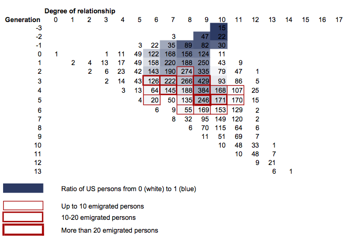
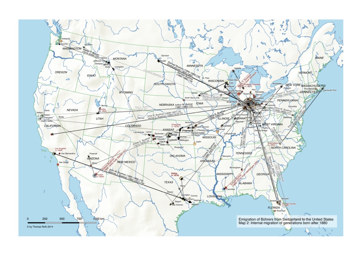
What kind of work did the Bührers live off? A total of 815 Bührers in the dataset (10% of which are women) have profession information ranging from general titles such as “farmer” to  very specific ones like “advanced planning manager at funeral home”.

Distribution of professions among Bührers

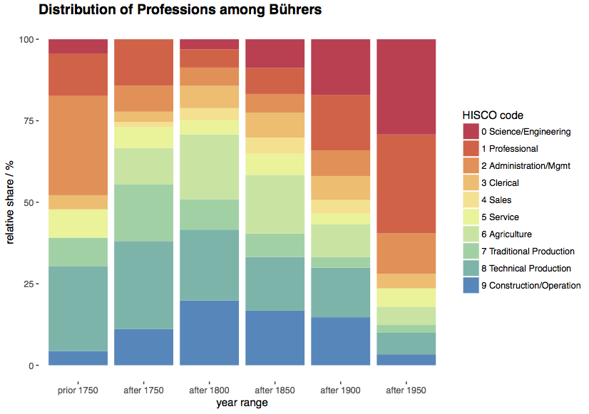
Professions have been coded with the Historical International Standard Classification of Occupations (HISCO) Tree of Occupational Groups, with modified category names to convey the predominant characteristic of the groups (categories 0-1, 7-9). The number of persons per time slice ranges from 23 (born prior 1750), 63 (born after 1750) up to 262 (born after 1850).

What comes as a surprise is the relatively low share of farmers (category 6) that never exceeded 20%. For most of the time there is a predominant share of production jobs, especially in the 18th and 19th century. Their nature, however, changed over time: e.g. from shoemakers to mechanics (category 8) or carpenters to factory workers (category 9). Not surprisingly some professions have ceased to exist, e.g. “Schalenmacher” (wooden bowl maker).
Women prior the 20th century had expected “woman professions” such as seamstress or nurse, with the odd teacher towards the end of the 19th century. It is only in the 20th century when “Professional, technical and related workers” (categories 0 & 1) become predominant occupations.

There is a clear bias to record/know professions with higher status, e.g. the “Vogt” (the equivalent of a bailiff) that features 6 times for the time slice up to 1750; the same holds true for other professions in the category 2 Administration/Mgmt such as “Gemeindepräsident” (mayor).

What does “family” mean or how related emigrated Bührers are to me

Back in 2011 when I started working with the Bührer dataset it was clear to me that all the emigrated Bührers are “family”, i.e. are more or less closely related to me. A first glimpse at the map’s family tree in 2015 showed that this assumption is somewhat shaky – most of the emigrated Bührers are rather distant relatives.

Degrees of relationship relative to me

A renewed look (see above) gives a more precise picture: relative to me (generation and degree of relationship = 0) the closest emigrated relative is Michael Bührer (generation = 5, degree of relationship = 6) who directly descends from the 10th generation of my direct line of ancestors. The degree of relationship of US persons (living or dead) ranges from 6th to 11th degree. Not that related after all…

Note that indicated degree of relationship according to my calculation (I didn’t find an authoritative source on how to calculate it) doesn’t increase in direct descendancy unless the generation is below 0.

How have Bührers spread throughout Switzerland?

Today, Bührers can be found in various cantons of Switzerland, however, most Bührers still hail from the Canton of Schaffhausen. How did this come about? A time series shows in 50-year steps from 1500 to 2000 (birth dates) where in Switzerland Bührers have been and how they’ve moved.

The earliest recorded Bührer in the dataset is Adam Bührer, who was born around 1533 in Bibern. Long-range migration in earnest starts only in the first of the 19th century.

Note that places have been aggregated at 2018 municipality level (e.g. Bibern and Hofen merged in 2009 with Thayngen). The circle size denotes the number of Bührers.

Revisited: Emigration of the Bührers from Switzerland to the United States

The original dataset from 2011 featured 4557 relevant persons (Bührers, spouses and their children/grandchildren). Up to 2017 the dataset had grown up to 9223 relevant persons, i.e. neatly doubled! This provided ample reasons to redo – with a couple of substantial improvements – the original mapping exercise.

Emigration of Buehrer to the United States – Map 1

The maps shows – as the earlier ones – the Bührers’ emigration to the United States (Map 1) up to the 1880s and subsequent internal migration up to now (Map 2).

Emigration of Buehrer to the United States – Map 2

A legend explains the symbology and the groups of emigrated Bührers with common ancestors. In contrast to the earlier maps there has been no manual tweaking, with exception of the orientation of the immigration arrows. The big challenge is clearly visible in Map 2: the larger number of persons means there’s really too much going on to fit it on one map!

The major changes compared to the earlier version in 2015 are:

  • Emigrated Bührers where matched against emigration/immigration evidence, e.g. passport lists, ships lists at port of embarkation, US immigration records and US census information. This allowed (see 2nd page of legend for emigrated groups of Swiss Bührers) to more accurately determine/narrow down the actual time of emigration.
  • Normalization, completion and geocoding of places was done using a person’s context (e.g. where other relatives had lived/died) to geocode places that otherwise would not be clearly identifiable (e.g. “West Rome Cemetery”). This allowed to geocode substantially more places and hence produces more migrations.
  • Determination of a common male ancestor was combined with deriving the family status for emigrants in a more robust procedure that can accurately handle also more complex cases such as three generations of emigrated Bührers with intermarriage with other emigrated Bührers. As a result some of the groups of emigrated Bührers have changed.
  • Assignment of persons to a time period (generations prior/beyond 1880) was reworked. This allows a flexible ad-hoc definition of periods based on the common minimal birth year of a group of siblings and their spouses. Furthermore extrapolation to ancestors/descendants via a generation offset (25 years) allows the period estimation of persons with no known birth year.

In terms of map-making the are few notable optimizations:

  • The number of distinct Bührer persons per county and common ancestry is indicated with pie charts, allowing to visualize both the total number of Bührers and the repartition by ancestry. QGIS 2.18 strictly speaking still doesn’t support this feature (treating diagrams as labels that float on top), but using a workaround with two map layers in the composer (one below with the base map including the pie chart diagrams and remaining places, the other above with the migration arrows and all the labels) did the trick.
  • Descendants are no longer shown (i.e. their immigration, migration as well as number of persons per county) because they are irrelevant/arbitrary in the US emigration context.
  • Meaningful migration labels are now fully computed, even though a few could still profit from manual tweaking. A custom label ranking for migration paths was developed to prevent label cluttering and lets the important labels prevail (e.g. those with first migration evidence). Place labels were optimized to only show first migration evidence (in red) if this occurred in the respective period.

Showing migration flows

The migration flows of the Bührers lend itself to visualisation with a chord plot, done with R‘s circlize package after a post by Guy Abel.

Bührer migration flows

The plot shows migration flows between regions as well as flows within a region that exceed 200 km. “Regions” are essentially place clusters that have been visually identified on the map. It includes all persons born as Bührer (“Named”) from the dataset, where migration can be inferred based on georeferenced events. Note that a particular person can feature in several flows, e.g. first emigrating to northwestern Ohio with a subsequent migration to Kansas.

In contrast to my maps – that only show the United States – you can also see that some Bührers emigrated to Brazil (around Curitiba) as well as India (Mangalore). Either migration is likely to predate the known emigration to the United States.

Analyzing the Bührer dataset

What data of the available Bührer dataset actually made it on one of the maps? A mosaic plot, done with the vcd package from the open source statistical software R (https://www.r-project.org), gives a quick overview over the relevant factors.

Mosaic plot of the Bührer dataset

The plot essentially shows areas proportional to the number of persons, ordered by the emigration status (left) and map # (top). For a given combination the successive blocks in the color red, black and grey denote Named, Married and Descendants persons respectively (see The methodology – preparing genealogical data for maps for explanations). These three categories make up roughly 4’500 persons of the original dataset, with the remainder not being shown. The small circles denote combinations that didn’t occur in the dataset.

A few observations:

  • Only a small fraction of persons in the dataset actually show up on map 1 and 2. This is comes as no surprise, given the large number of e.g. Swiss-based Bührers, “Assumed US” persons as known descendants of emigrants with no place information or “Undetermined” persons where location information could neither be determined nor inferred.
  • The number of Bührers emigrating for the generation prior 1880 (map 1) is significantly larger than the number of emigrating spouses from Switzerland, reflecting the fact that most married once overseas. A look at the category “Third country emigrated to US” indicates that a substantial part of the Bührers – at least for the first generation – preferred to marry other emigrants.
  • There’s very little Bührer emigration happening for the generations born after 1880 (map 2) – almost all Bührers in that period are America-born.

The plot has featured in a small presentation R User Meetup Mosaic plot Thomas Roth 20160803 (includes the R code) in a Zurich R User Group Meetup.

Plotting the map’s family tree

The – with 13 A3 pages very wide – family tree (Family Tree of Emigrated Buehrers) shows all persons that emigrated to the United States including their ancestors as well as their immediate relatives. Persons are aligned horizontally by generation, with oldest generations on the top. Squares denote males, circles females and triangles marriages. Persons represented by black line symbols are shown on the map whereas those with grey line symbols are not. Otherwise symbology follows the one for the map, i.e. line styling indicates category and colours show common male ancestors.

Family Tree of Emigrated Buehrers - Detail
Detail of the family tree of emigrated Bührers

Data for the family tree was prepared in the project’s PostgreSQL database stripping irrelevant persons and families. The family tree was drawn in yEd (http://www.yworks.com) in “Family Tree” mode and styled via Properties Mapper.

The map – generalization challenges to preserve map readability

Symbology and family references in square brackets are explained in the legend.

Map detail showing ranking-driven labels
Map detail showing ranking-driven labels in the main immigration area around Fulton county

Styling of the map was inspired by the Schweizer Weltaltas (http://schweizerweltatlas.ch)

  • Migration paths from/to overseas were displayed as point decorations with arrows, with label position and orientation calculated. To minimize clutter in the area in northwestern Ohio all arrows were demoted by a fixed distance and aligned on a circle grouped by destination and origin. Internal migration paths in contrast were real lines. All migration paths made extensive use of data-defined properties to control colour (emigration generation), dashing (person scope), line width (number of persons) as well as the label styling.
  • The number of distinct Bührer persons per county and common ancestry is indicated by the circle size. Distinct common male ancestors having a different colour that increases with their presumed emigration period going from red (early emigrants) to blue (late emigrants).
    Counties with Bührers from different ancestry have an additional transparent circle with bold lines to indicate the sum of Bührers. Given the restrictions in QGIS with overlay charts a representation as pie chart was not possible nor practical, given the large number of Bührer persons evidenced e.g. in Fulton County.
  • A custom label ranking for places was calculated to prevent label cluttering above all in Ohio and to ensure that place names representing the largest Bührer population will prevail.
  • Certain label information such as place names in red with first migration evidence in a certain region or labels for first-time migration paths between regions were forced to be always displayed. Label positioning in general and the label text of migration paths in particular was extensively manually tweaked to optimize the map.

Improving content and readability is probably best explained by comparing the final result with an earlier one-map version in QGIS 1.8 where point decorations with arrows were not yet supported.

Emigration map - first version with QGIS 1.8
An earlier version of the map project done with QGIS 1.8. The “missile attack” immigration paths obscure most of the map. Note the GIS data artifacts e.g. around the Great Lakes prior using superior Natural Earth GIS data.

The methodology – preparing genealogical data for maps

The production of the map showing the emigration of Bührers from Switzerland to the United States relied on the following, largely self-developed sequential steps:

  • Normalization, completion and geocoding of places used for family and persons events
  • Identification and categorization of in-scope persons, notably persons born as Bührer or name varieties such as Buehrer (“Named”), spouses (“Married”) and their children/grandchildren (“Descendant”) that have different family names
  • Constructing a sequence of geocoded events for a person’s life, also considering childbirth for women. In case geocoded events lacked dates a natural sequence was assumed, i.e. birth followed by marriage, childbirth, death and burial.
  • Determination of an emigration/residence status relative to Switzerland, the US or third countries. Of particular interest were those that emigrated to the US as well as confirmed or assumed US residents
  • Determination of a common male ancestor for all Bührers that emigrated or have lived in the US and the generation relative to him
  • Deriving a family status for emigrants, i.e. whether emigrants emigrated as single, with their spouse or family
  • Assignment of persons to a time period (generations prior/beyond 1880) based on known birth years, ensuring a consistent assignment of couples and siblings to the same period
  • Construction of migration path segments following the sequence of geocoded events
  • Aggregation of migration paths per county and time period, including aggregated indicators such as the category of in-scope person with Bührer prevailing and the minimal generation involved
Geocoding places in MacFamilyTree
Sample PostgreSQL script
Sample PostgreSQL script (categorization of in-scope persons)

Mapping the Emigration of the Bührers from Switzerland to the United States

In the second half of the 19th century many farmers emigrated from the rural communities of the Swiss canton of Schaffhausen, mainly due to a local agricultural crisis and better economic prospects elsewhere. There were emigration peaks around 1850, 1870 and in the 1880’s with a large majority of emigrants heading to the United States. From 1868 to 1890 an equivalent of more than 10% of the canton’s population had left, a large number for Swiss standards at the time.

Among the emigrants were many Bührers from the small hamlets of Bibern, Hofen, Opfertshofen as well as from Herblingen and Stetten in the Reiat region. Originally immigrated from southern Germany the Swiss Bührer at large remained constrained to that tiny corner of Switzerland, which greatly facilitates genealogical research.

Emigration of Buehrer to the United States - Map 1
Emigration of Buehrer to the United States – Map 1

The maps shows the Bührers’ emigration to the United States (Map 1) up to the 1880s and subsequent internal migration up to now (Map 2). Almost all of them initially immigrated to a small area in northwestern Ohio around the city of Archbold in Fulton County; some of them migrated further west to Kansas, Texas or the Pacific Northwest.

In order to provide the necessary historic context Map 1 shows historic state boundaries, population density as well as the railway network (the main mode of transportation for Swiss emigrants) at 1870, the heyday of the Bührer emigration.

Emigration of Buehrer to the United States - Map 2
Emigration of Buehrer to the United States – Map 2

A legend explains the symbology.