The map – generalization challenges to preserve map readability

Symbology and family references in square brackets are explained in the legend.

Map detail showing ranking-driven labels
Map detail showing ranking-driven labels in the main immigration area around Fulton county

Styling of the map was inspired by the Schweizer Weltaltas (http://schweizerweltatlas.ch)

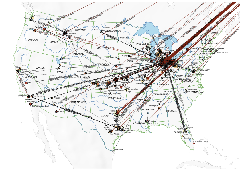
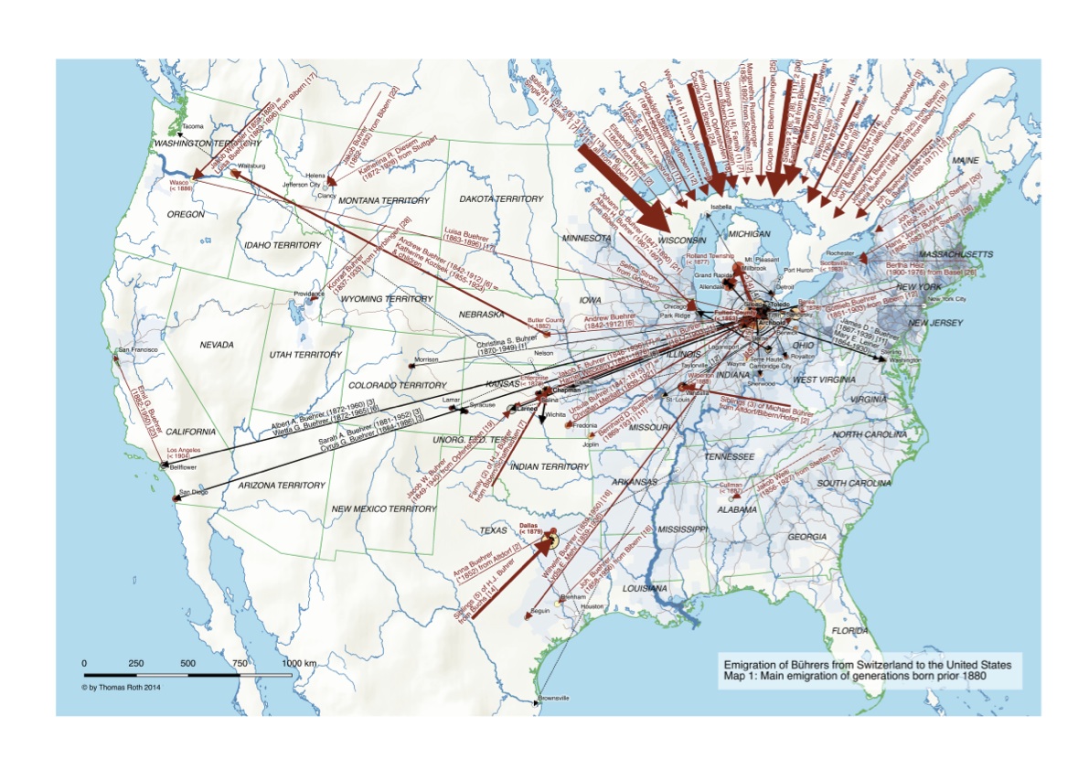
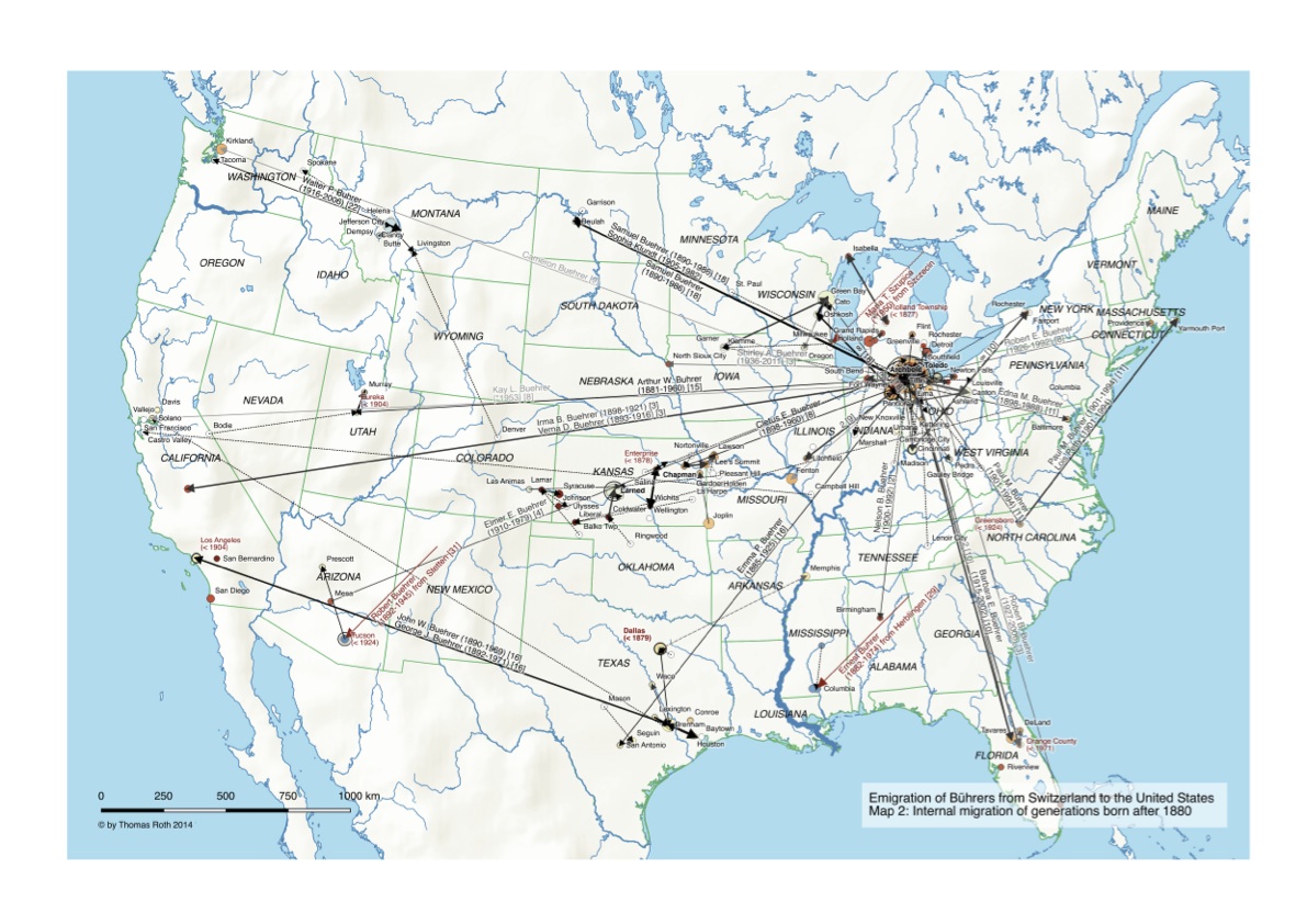
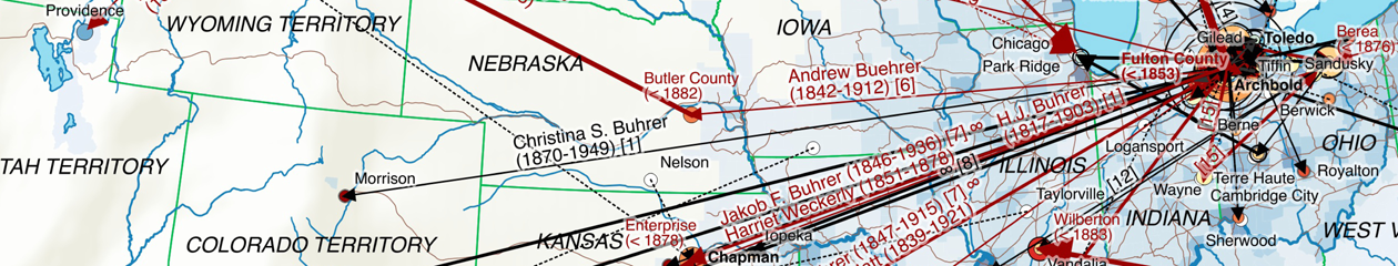
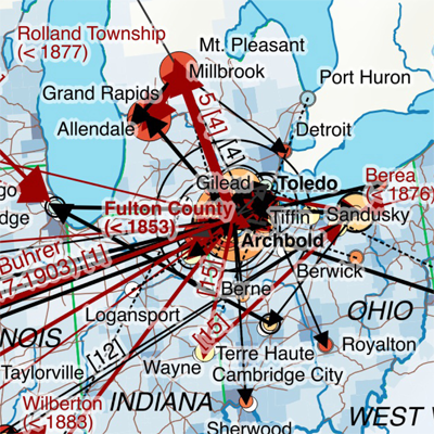
  • Migration paths from/to overseas were displayed as point decorations with arrows, with label position and orientation calculated. To minimize clutter in the area in northwestern Ohio all arrows were demoted by a fixed distance and aligned on a circle grouped by destination and origin. Internal migration paths in contrast were real lines. All migration paths made extensive use of data-defined properties to control colour (emigration generation), dashing (person scope), line width (number of persons) as well as the label styling.
  • The number of distinct Bührer persons per county and common ancestry is indicated by the circle size. Distinct common male ancestors having a different colour that increases with their presumed emigration period going from red (early emigrants) to blue (late emigrants).
    Counties with Bührers from different ancestry have an additional transparent circle with bold lines to indicate the sum of Bührers. Given the restrictions in QGIS with overlay charts a representation as pie chart was not possible nor practical, given the large number of Bührer persons evidenced e.g. in Fulton County.
  • A custom label ranking for places was calculated to prevent label cluttering above all in Ohio and to ensure that place names representing the largest Bührer population will prevail.
  • Certain label information such as place names in red with first migration evidence in a certain region or labels for first-time migration paths between regions were forced to be always displayed. Label positioning in general and the label text of migration paths in particular was extensively manually tweaked to optimize the map.

Improving content and readability is probably best explained by comparing the final result with an earlier one-map version in QGIS 1.8 where point decorations with arrows were not yet supported.

Emigration map - first version with QGIS 1.8
An earlier version of the map project done with QGIS 1.8. The “missile attack” immigration paths obscure most of the map. Note the GIS data artifacts e.g. around the Great Lakes prior using superior Natural Earth GIS data.

The methodology – preparing genealogical data for maps

The production of the map showing the emigration of Bührers from Switzerland to the United States relied on the following, largely self-developed sequential steps:

  • Normalization, completion and geocoding of places used for family and persons events
  • Identification and categorization of in-scope persons, notably persons born as Bührer or name varieties such as Buehrer (“Named”), spouses (“Married”) and their children/grandchildren (“Descendant”) that have different family names
  • Constructing a sequence of geocoded events for a person’s life, also considering childbirth for women. In case geocoded events lacked dates a natural sequence was assumed, i.e. birth followed by marriage, childbirth, death and burial.
  • Determination of an emigration/residence status relative to Switzerland, the US or third countries. Of particular interest were those that emigrated to the US as well as confirmed or assumed US residents
  • Determination of a common male ancestor for all Bührers that emigrated or have lived in the US and the generation relative to him
  • Deriving a family status for emigrants, i.e. whether emigrants emigrated as single, with their spouse or family
  • Assignment of persons to a time period (generations prior/beyond 1880) based on known birth years, ensuring a consistent assignment of couples and siblings to the same period
  • Construction of migration path segments following the sequence of geocoded events
  • Aggregation of migration paths per county and time period, including aggregated indicators such as the category of in-scope person with Bührer prevailing and the minimal generation involved
Geocoding places in MacFamilyTree
Sample PostgreSQL script
Sample PostgreSQL script (categorization of in-scope persons)

Mapping the Emigration of the Bührers from Switzerland to the United States

In the second half of the 19th century many farmers emigrated from the rural communities of the Swiss canton of Schaffhausen, mainly due to a local agricultural crisis and better economic prospects elsewhere. There were emigration peaks around 1850, 1870 and in the 1880’s with a large majority of emigrants heading to the United States. From 1868 to 1890 an equivalent of more than 10% of the canton’s population had left, a large number for Swiss standards at the time.

Among the emigrants were many Bührers from the small hamlets of Bibern, Hofen, Opfertshofen as well as from Herblingen and Stetten in the Reiat region. Originally immigrated from southern Germany the Swiss Bührer at large remained constrained to that tiny corner of Switzerland, which greatly facilitates genealogical research.

Emigration of Buehrer to the United States - Map 1
Emigration of Buehrer to the United States – Map 1

The maps shows the Bührers’ emigration to the United States (Map 1) up to the 1880s and subsequent internal migration up to now (Map 2). Almost all of them initially immigrated to a small area in northwestern Ohio around the city of Archbold in Fulton County; some of them migrated further west to Kansas, Texas or the Pacific Northwest.

In order to provide the necessary historic context Map 1 shows historic state boundaries, population density as well as the railway network (the main mode of transportation for Swiss emigrants) at 1870, the heyday of the Bührer emigration.

Emigration of Buehrer to the United States - Map 2
Emigration of Buehrer to the United States – Map 2

A legend explains the symbology.

Analysis, visualisation and map-making with genealogical data